Content Marketing – Strategy, Collaboration & Communication


As a final assignment the class asked to create groups and  work with a real client  to create a social media plan for their business . As part of the plan we explored content marketing strategies for our client.

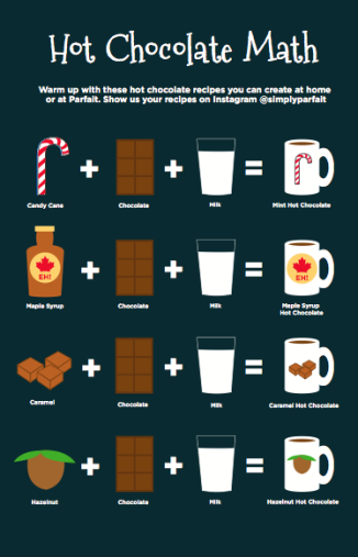
The client given to us was Parfait, A recently established frozen yogurt bar/café located on Princess St. in downtown Kingston. Parfait handcrafts their yogurts daily.  They  also provides a full espresso bar, fresh brewed coffees and teas,smoothies, juices, and specialty coffees. Parfait differentiates themselves from the competitors by creating a relaxing social atmosphere where students & residents can create customized menu options.

The purpose of this project is to gain understanding of the company and their strategic goals to  develop an effective, measurable, content marketing plan for content marketers & developers.

The intial objectives of this content marketing plan were to:
• Create or increase brand awareness
• Engage customers, buyers, influencer’s
• Drive sales, generate leads (trial purchase, subscription, sign-ups, etc)
• Improve loyalty and retention

Based on research of the business and our meeting with the client we established a primary & secondary target audiences :

Primary Audience

Demographic: 18 -25, Years of age, female, student

Psychographic: Interested in trends, enjoys socializing, impulsive/ immediate gratification seeker, enjoys treating themselves

Geographic: Kingston Resident

Technographic: Tech savvy (owns mulitple devices), uses the several times throughout the day, uses devices to; organize, look at trends, objective/purpose, target and buyer stage, tactics, tone, etc.

Secondary Target Audience 

Demographic: 25- 45 Years of age, any gender, employees / business owners in the down town core

Psychographic: Interested in trends, time conscious, impulsive | immediate gratification seeker, enjoys treating themselves

Geographic:  Kingston Resident/ downtown worker

Technographic: Tech savvy (owns mulitple devices), uses the several times throughout the day, uses devices to organize, look at trends, email & general entertainment


screen-shot-2016-12-13-at-1-40-31-am


screen-shot-2016-12-13-at-1-40-52-am


Millers Law, Millers Magic 7, The Magical Number Seven, Plus or Minus Two

This year we are starting a new course called Information Design.  
What is Information Design?
 The best explanation I have heard is from  The Society for Technical Communication who said, Information Design is “the translating of complex, unorganized, or unstructured data into valuable, meaningful information”. I would love to say that my brain retains all of the information given to me during this 3 hour class but, unfortunately it does not but, according to Millers Law thats ok! One thing that did peak my interest last class was,

Millers Magic 7
The General breakdown of Millers Magic 7 is that the average person can only retain about 7 pieces of information. If more information is added, then it must be put into groups or “chunked” so that it is easier to remember. Once the information is “Chunked” people can generally retain an additional 2 pieces information (Millers 7+2). Once those pieces of information have entered our short term memory, our brain makes a choice as to what information is relevant and will go on to be stored stored in our long term memory. Anything that is not considered relevant or important is then dismissed. Of course, its a little more involved than that but for blogging purposes, this explanation will do.

How does this relate to Graphic Design or more specifically, Information Design? When designing and simplifying information and instructions for people we as designers need to be careful how we choose to layout information. We need to make sure that it is clear, concise and also, that it leaves the user feeling happy  and less stressed because the information provided is not confusing or frustrating.

One way we could apply this principal is to web design. I have been combing through many different webpages and some of the most popular pages such as, Google or Facebook use a limited number of categories in their navigation bar, 7 to be exact .  Users need to be able to navigate effortlessly on a webpage so they will enjoy their experience. A person may not remember all of the specifics about a particular site but if the information is grouped in an easily, memorable way it will keep a person coming back. After separating content from site into seven main categories the information can then be “chunked”  so that it is sub categorized and easy to find. Web design is not the only place I feel this principle can be applied to it could also be very effective in helping with instructional designs or  in learning design tools for educators. Millers theory has been debated in many circles, but personally I feel that when used properly can be effective in the world of design.

Drawing Inspiration and Realization

I came into the Graphic Design program with what I thought were some fairly strong drawing skills.

You don’t have to be a visual artist to be a graphic designer but I definitely found that it helped me produce more well thought out pieces. When I was younger, almost all of my drawings were from photographs, I had a hard time thinking of an idea and actually drawing it out to look the way I envisioned it in my mind. I always thought of imitation as a weakness and never saw myself as a real artist because I always needed some kind of reference to look at. I believed that if I looked at something, then it was cheating and it didn’t count as art, but over the course of time my views on this topic have shifted. All of my years of drawing magazine ads and photographs have actually made drawing out my own ideas a lot easier. For every copy of a piece I made, I was learning something new about light, shape, characteristics,proportions, etc. Fairly recently I have come to terms with the fact that there is nothing wrong with using references for your art. I would never have known how to draw the face of an Orangutan for my school assigned animal portrait, it probably would have ended up looking like some strange unknown species of primate if I hadn’t collected photos and studied them.
Coming up with your ideas may be easy but you have to practice if you want to put them on paper properly.
Even when you have strong skills, never give in and think that its good enough the way it is. There is ALWAYS room for improvement, the harder you are on your own art, the better you will become as an artist.
wpid-img_51876343446340.jpeg

An ink piece I completed in my own style in my drawing class this semester, it was done with indian ink and micro pens.