This is a redesign for educational purposes only.
Live Out There provides their customers with products and useful information that will help their customers get the best possible experiences from their outdoor adventures. Instead of expanding their locations Live Out There decided to take an aggressive Online approach that enables them to reach a wider market with products, inspiration and lifestyle information while giving their customers fast efficient service
This logo will be used mostly Online, in the initial design this was not carefully considered and the Logo was in need of refining. The original design had a variety of line thicknesses and the company required something that was long lasting a scalable
The abstract shape of the mountain was aligned to a grid and constructed using the X and Y height of the L in the logo type. While it was still an abstract object the careful complementary measurements and fine tuning gave it a more structured and well designed look making it a more simplistic and scalable object.
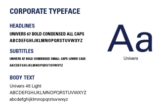
The typeface for the logo remained the same, Univers is a font that is now available for the web. It also has a variety of weights and styles that makes it a font that is able to be used as their corporate type face.
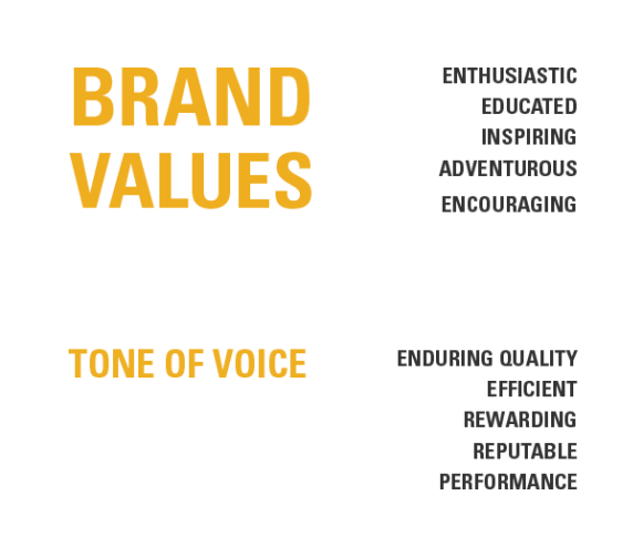
When the rebranding process was complete, the logo became part of a much larger picture. A brand identity was already in the process of being being formed. One of the key components to developing a good brand is understanding the companies brand values and establishing a tone of voice that is clearly applied and visible in every aspect the company.
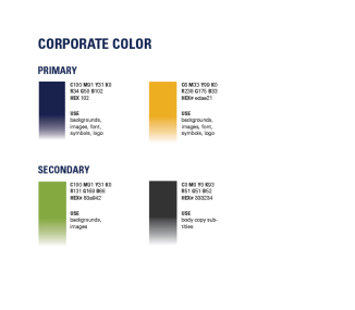
The idea for the company came to life while the founders were climbing Mount Everest and the blue chosen in the primary colours is inspired by the breathtaking richness of the night sky. The original Live Out There brand was done in an orange, being vibrant and daring is important to the company but because of the richness of the blue a bolder color was needed.
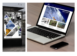
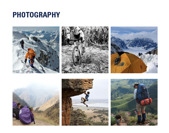
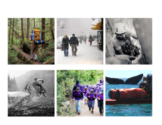
 A brand guide was created and photo page designed to inspire and help employees better understand the tone and mood. The brand is about community and exploration and they have really tried to include their clients by allowing them to tag photos of their own journeys. Originally the majority of the photos used were filtered and usually not high image quality but this kind of photography is not effective when trying to express the quality of a brand. The photos displayed in the brand guide are high quality black and white photos that are typically used when showing intense activities that may have more motion. The black and white photos are paired with vibrant , crisp, clear, breath taking photos that do not have filters on them, show casing the earths natural beauty.
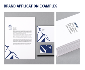
A variety of applications were explored during this process. In future, more application such as a personal clothing brand, social media extensions and unique packaging design will likely be explored.
